 老爹首頁
老爹首頁


服務項目
特別關鍵字
本網站僅提供設計老爹資訊參考平台, 並不涉入其中任何諮詢、交易。本網站對各該設計老爹相關資訊亦不作任何實質或形式上之審查。本網站中所載一切設計老爹的資訊、文字、照片、圖形 、產權、廣告內容、或其他資料(以下簡稱『內容』)。無論其為公開張貼或私下傳送,若有不實或違法情事,均為『內容』提供者之責任,設計老爹概不負責也不承擔任何法律責任。
免責聲明
宸居專欄
ARCH雅趣|上好A1-12
Buds and Soil
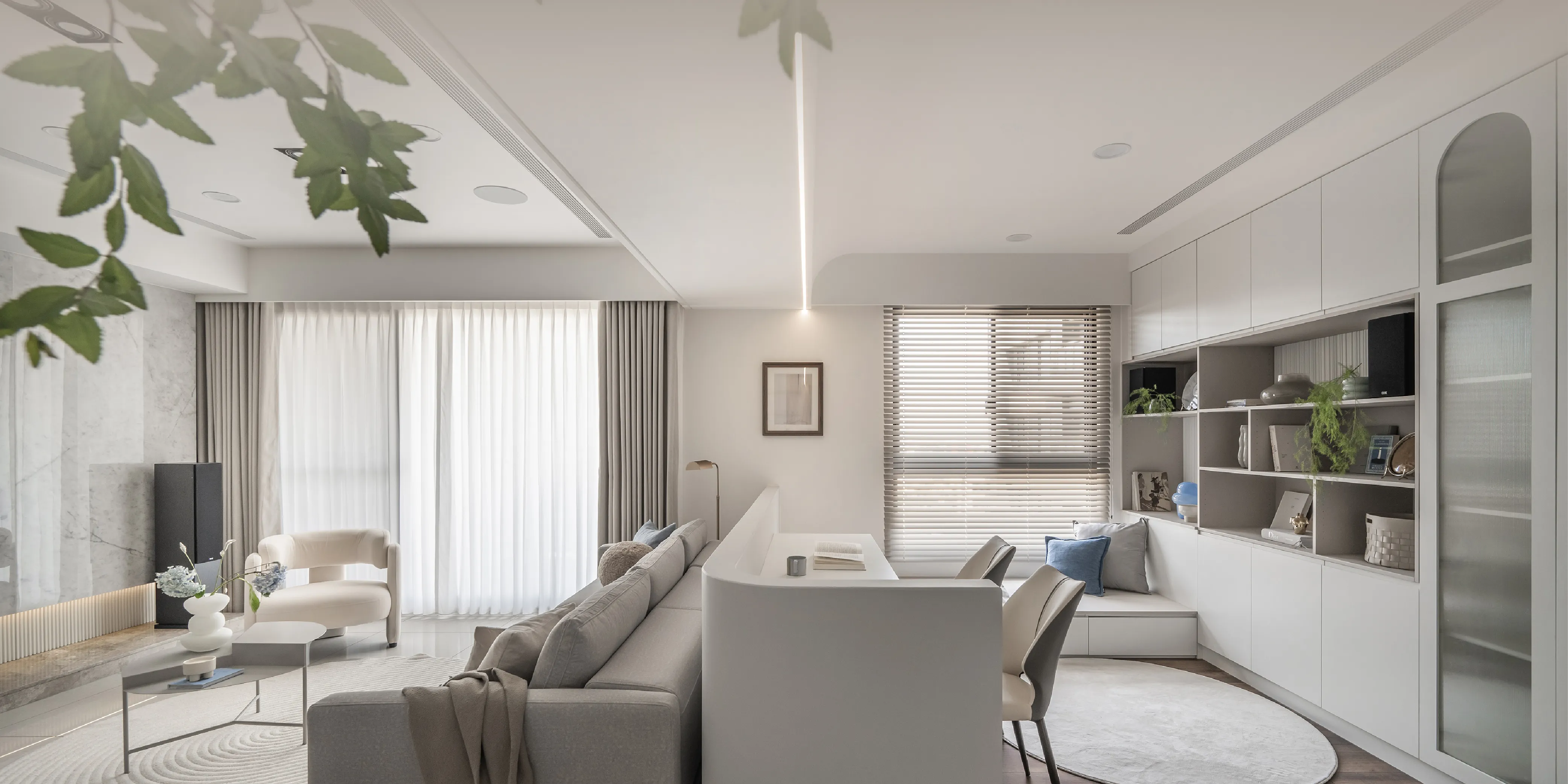
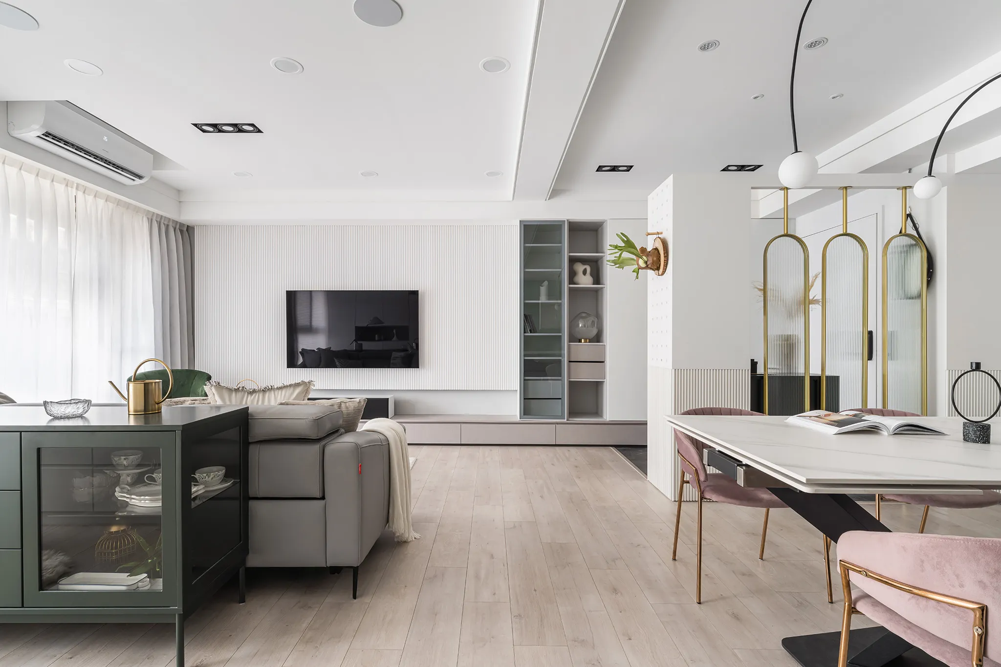
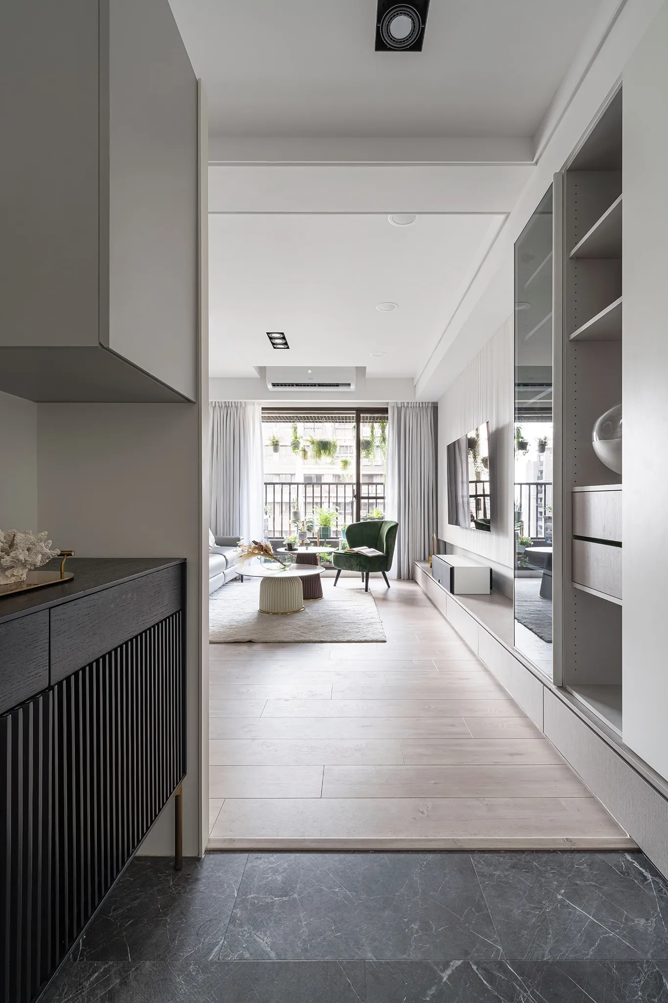
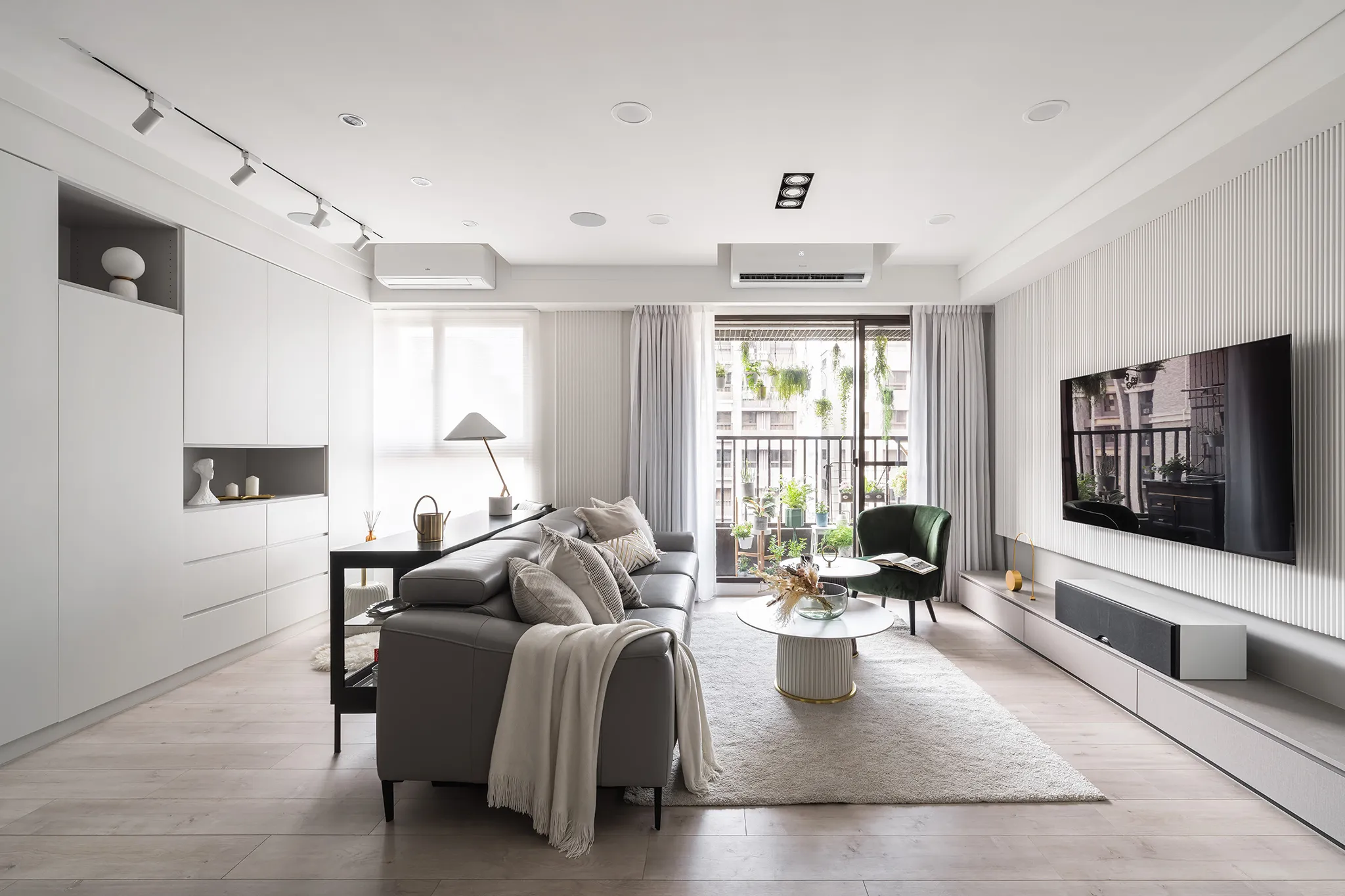
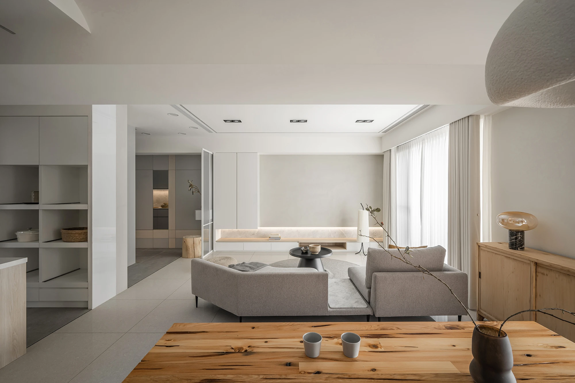
Project Overview
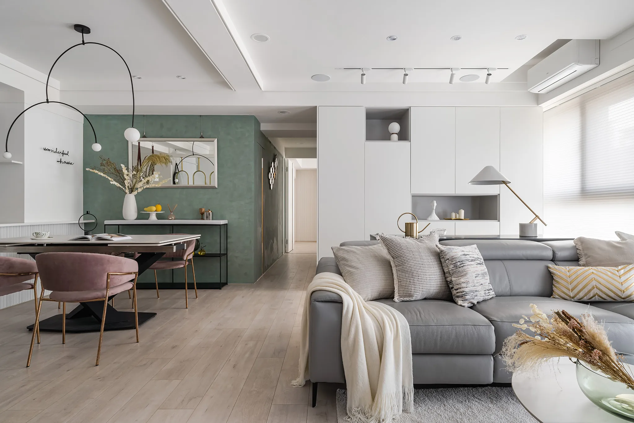
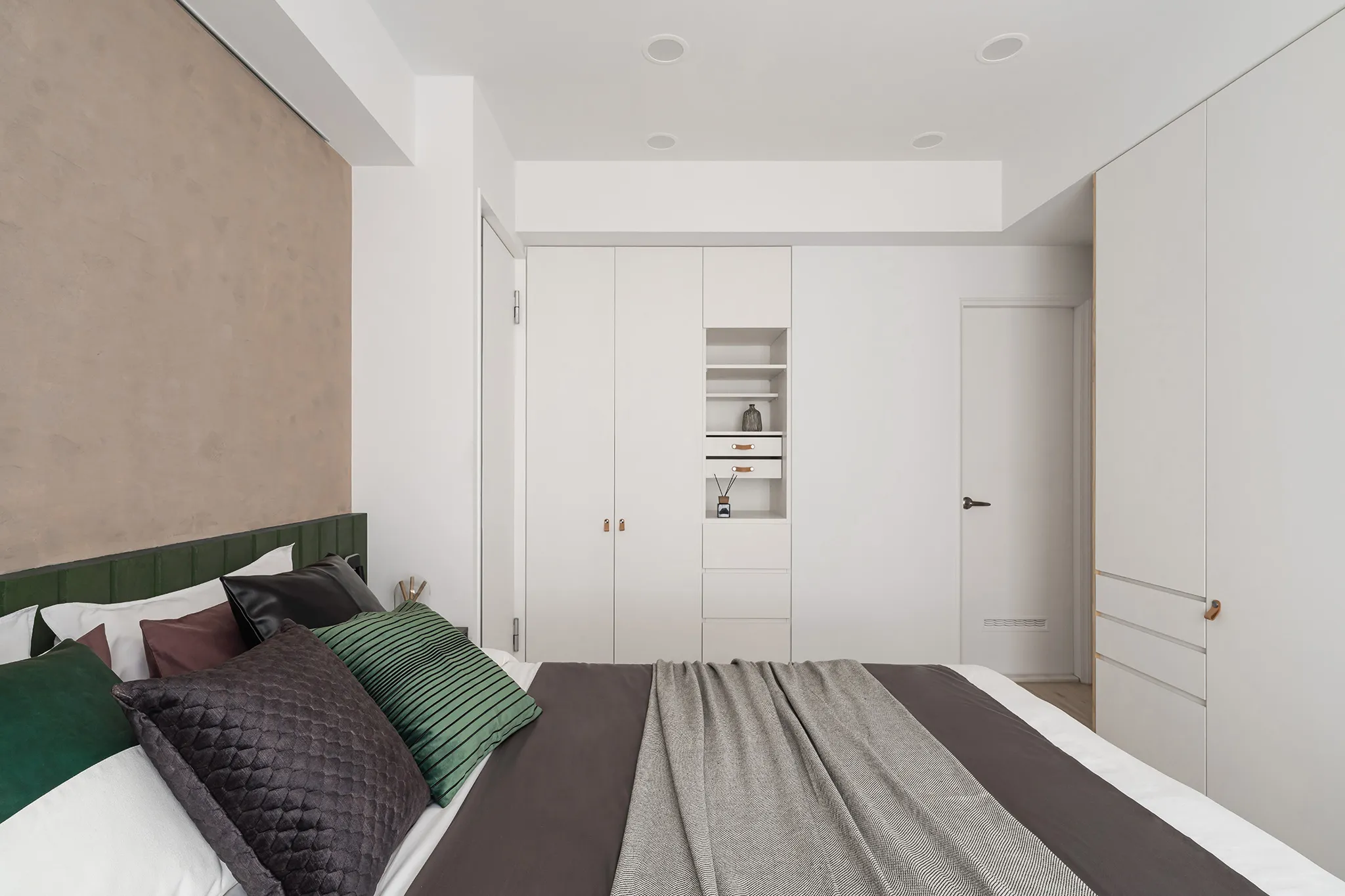
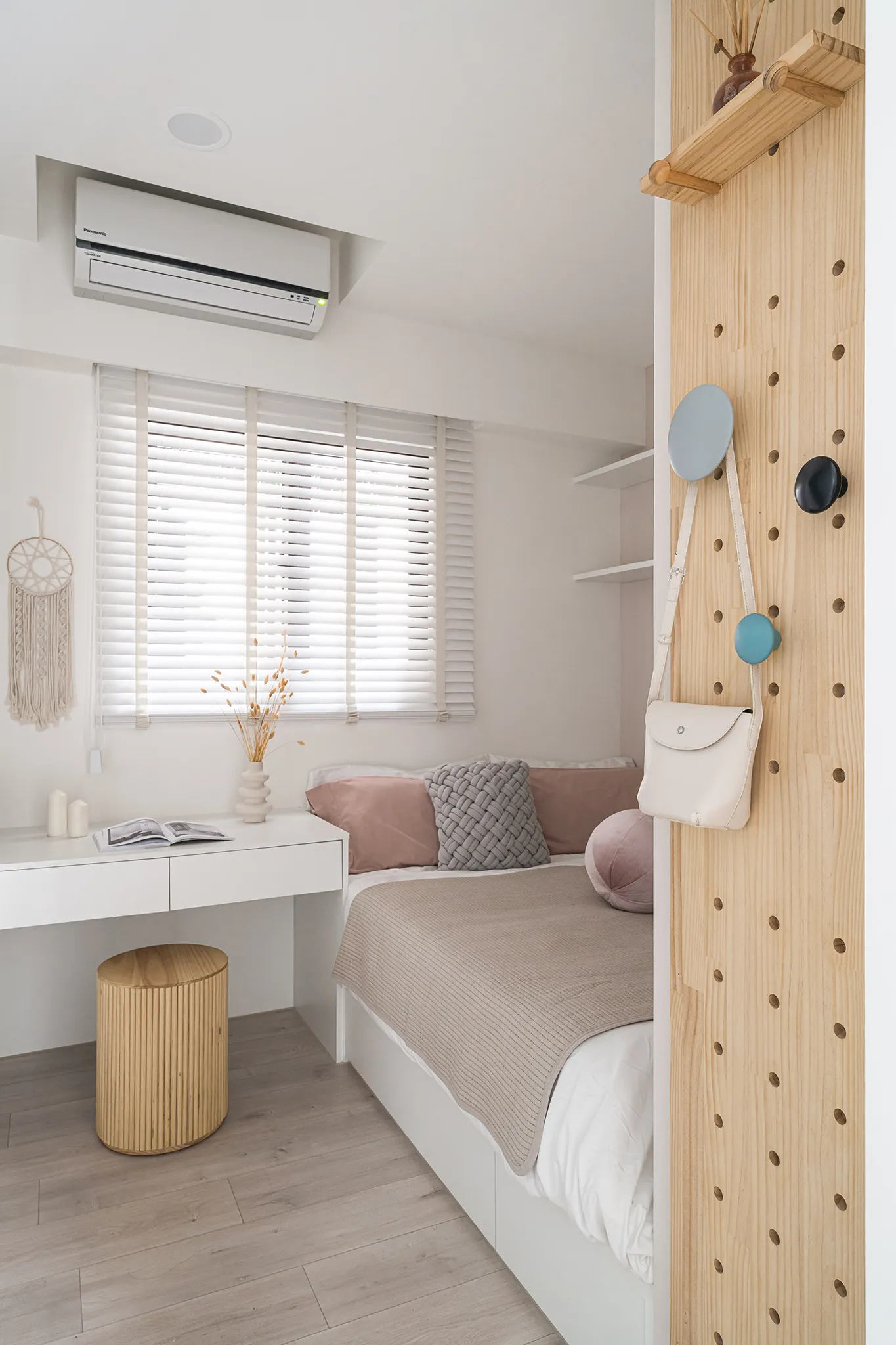
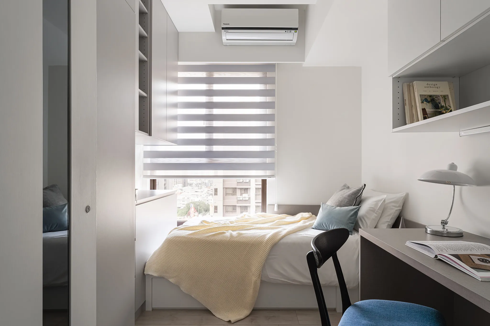
The name of the project, "Buds and Soil", comes from the designer's clever color plan. He uses white as the base and adds low-saturation colors to present a cozy look and reorganizes the layout to effectively utilize every inch of space. The comfort of the space is obvious, as the warm wood and mineral paint blend to form a comfortable space. In terms of functionality, the designer installs different forms of cabinetry to provide storage and adds reflective materials to enhance brightness there was no light. All in all, the designer conveys a diverse visual effect through the aesthetic expression of light and shadow to complement the client's favorite plants. It is also worth mentioning that the cavity panel not only provides the hanging storage function but also highlights the dangling plants.Project Brief
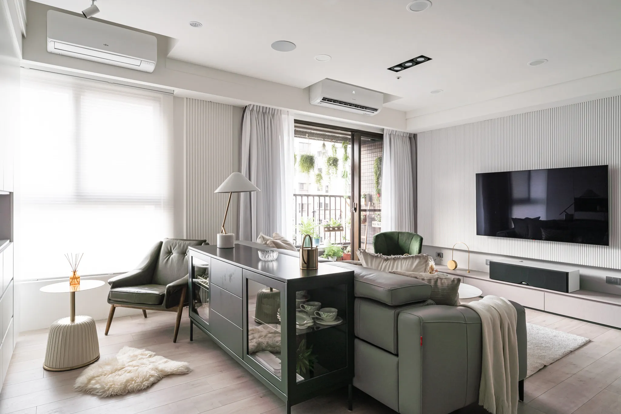
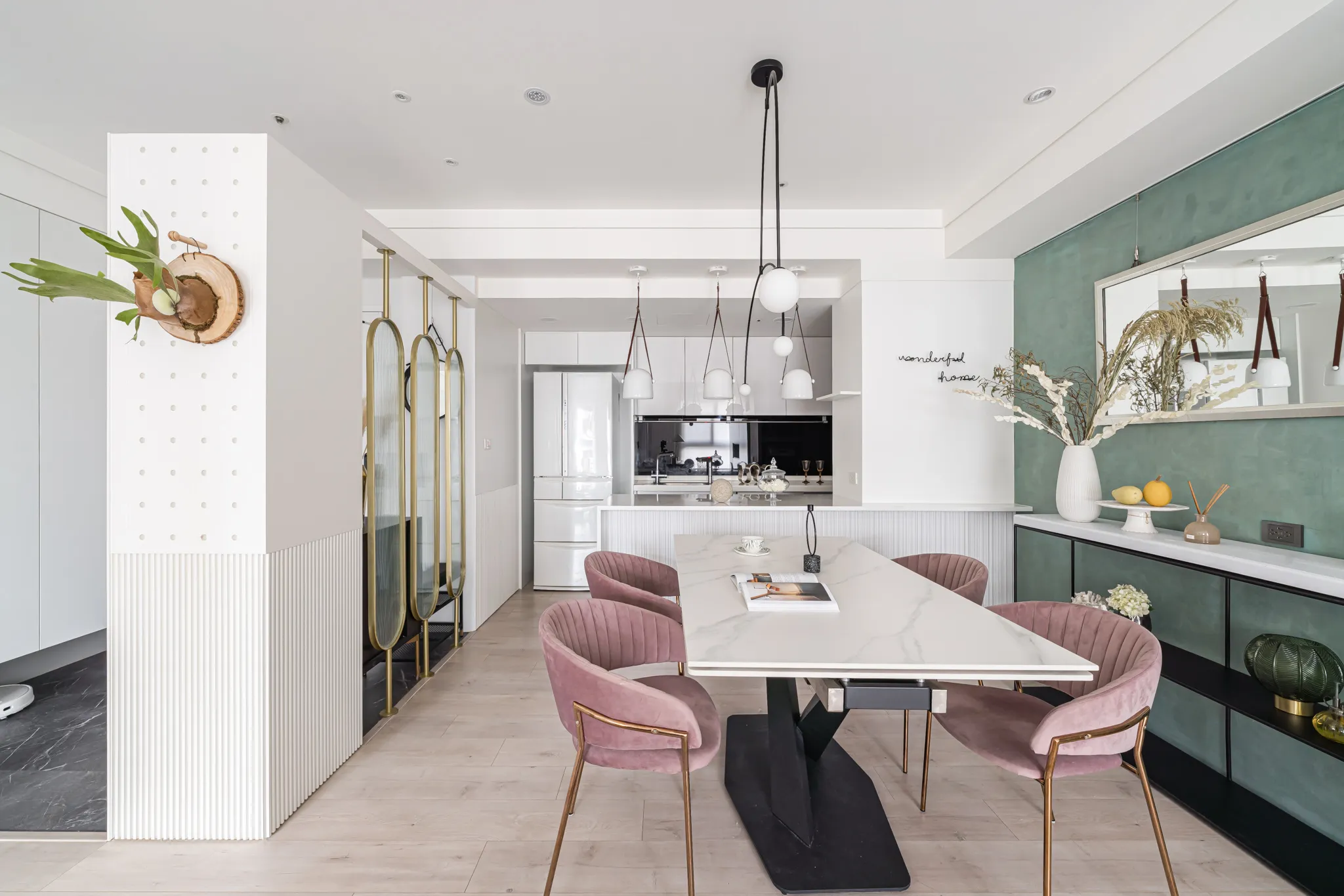
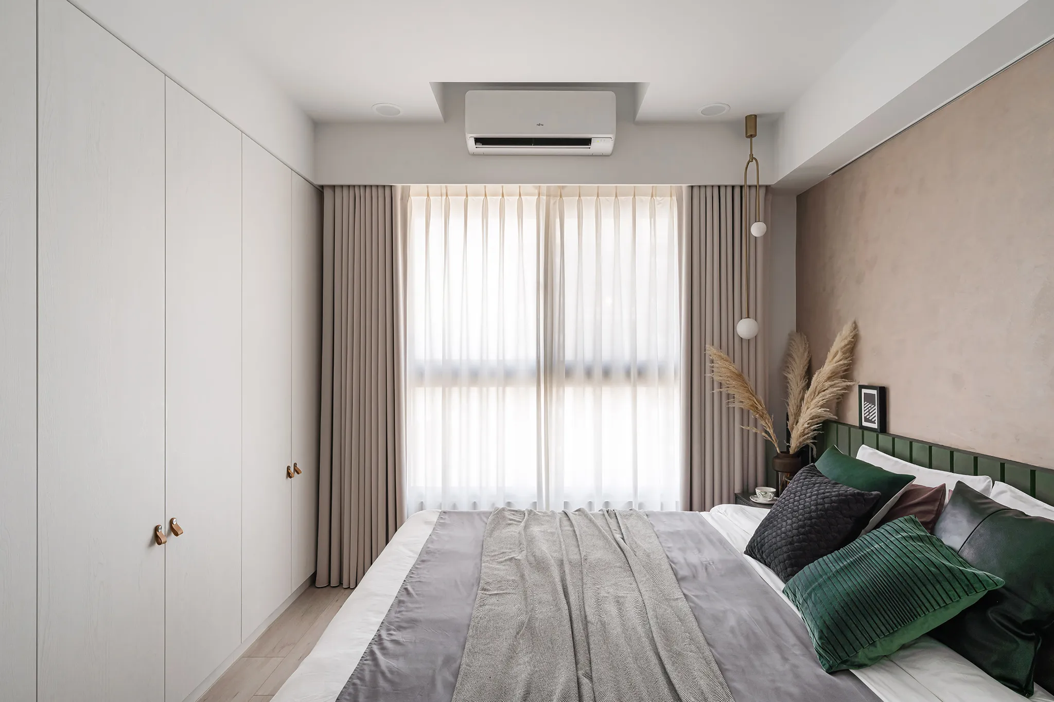
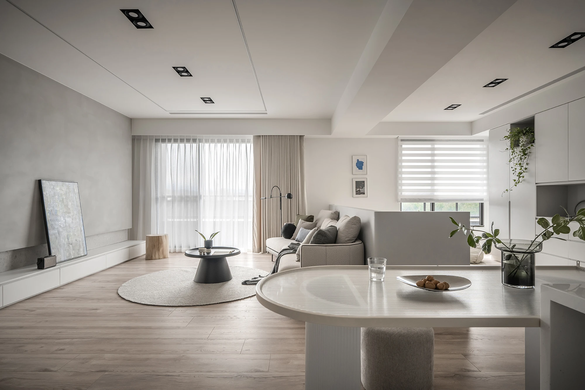
"The buds sprout from the soil and flourish with the light." The project has a large area of light supplemented by the client's favorite planting as an accent to life. The space sets daylight and color as the main characters, allowing light and shadow to spread naturally. At the same time, the low-saturation paint with mineral coating texture resembles the soil covered by sunlight, and the boundary between the interior and exterior is dissolved through color and light. In this way, the daylight and the vitality of the plants are displayed together in an aesthetically pleasing space. From the foyer, plants and the light echo each other harmoniously in the public area. White, gray, and green present a pure color aesthetic, and the glass and iron make the space not too monotonous. The private area also has low-saturation colors to outline the atmosphere, and leather and grilles to express the subtle dimension.Project Need
Rhythm from the spaceThere are many lines in the public area, such as the moru glass in the vista and the grille in the wall, which show the sense of natural movement. The non-formal lines, including the rounded titanium-plated metal, special-shaped chandeliers, and soft leather fixtures, give the open public area a lively rhythm at the same time.
Diverse layers
For the color, the designer takes white and gray as the base. The interaction between gray and white is perfect as if the border between indoors and outdoors is eliminated by daylight and shade. In addition, a layer of low-saturation green is added to the light-colored space, its naturalness and the warmth of the wood grain harmonize the atmosphere and provide a unique look.Design Challenge
A great designer must have plenty of practical experience and aesthetic sense, but also to communicate with clients, which can be said to be the key to linking the house and family. In the planning of an interior from scratch, the designer provides easy-to-understand answers to the client's concerns, including building materials, layout, color, etc., all of which the designer needs to face and overcome to become a holistic designer.Sustainability
The project's open plan emphasizes the lighting advantages of the site and makes more efficient use of every inch of space after re-planning. Equally important, the removal of unnecessary partitions enhances lighting. In the corridor, the designer uses glass to bathe the space in the sunlight, allowing family members and plants to thrive in the light. For the building materials, Green Building Materials-certified materials are selected for the project, including system cabinets and paints. System cabinets are one of the most popular materials in the recent interior design market, they are long-lasting, removable, and portable. As for the paint, it is Benjamin paint, which is stain-resistant and can be heat-repaired to keep the surface clean, reducing maintenance costs.項目概述
項目名稱「花蕾與土壤」源自於設計師巧妙的色彩搭配。他以白色為基調,並運用低飽和度色彩營造溫馨舒適的氛圍,同時重新規劃佈局,有效利用每一寸空間。溫暖的木材與礦物塗料的融合,打造出舒適宜人的環境,空間的舒適感顯而易見。在功能性方面,設計師安裝了不同款式的櫥櫃以提供充足的儲物空間,並在光線不足的地方運用反光材料來提昇亮度。總而言之,設計師透過光影的巧妙運用,營造出豐富多樣的視覺效果,與顧客喜愛的植物相得益彰。值得一提的是,吊櫃面板不僅提供了懸掛式儲物空間,還巧妙地襯托出垂吊植物的姿態。專案簡介
「花苞破土而出,沐浴在陽光,茁壯成長。」該計畫擁有大面積的採光,並以顧客喜愛的植物點綴,增添生氣感。空間以日光和色彩為主角,光影自然流動。同時,低飽和度的礦物塗層質感塗料,宛如陽光下的土壤,色彩與光線模糊了室內外的界線。如此一來,日光與植物的活力在賞心悅目的空間中交相輝映。從門廳進入,植物與光線在公共區域和諧交融。白色、灰色和綠色呈現出純淨的色彩美感,玻璃和鐵藝的運用則避免了空間的單調。私密區域同樣以低飽和度色彩勾勒氛圍,皮革和格柵則展現出微妙的質感。專案需求
空間節奏:公共區域運用了許多線條,例如觀景台上的莫魯玻璃和牆面上的格柵,展現出自然的動感。同時,圓潤的鈦金屬、造型獨特的吊燈和柔軟的皮革裝飾等非正式線條,也為開放式的公共區域賦予了活潑的節奏。
豐富的層次:
在色彩方面,設計師以白色和灰色為基調。灰白之間的完美交融,彷彿在光影的交錯下,模糊了室內外的界線。此外,淺色調的空間中還點綴了一層低飽和度的綠色,其自然的質感與木紋的溫暖相得益彰,營造出獨特的視覺效果。
設計挑戰
優秀的室內設計師不僅要具備豐富的實務經驗和美感眼光,還要善於與客戶溝通,可以說是連結房屋與家庭的關鍵。從零開始規劃室內空間時,設計師需要針對客戶的各種疑問,例如建築材料、佈置、色彩等等,提供簡單易懂的解答。所有這些都是設計師需要面對和克服的挑戰,才能成為一個全面的室內設計師。永續性
該項目採用開放式佈局,充分利用了場地的採光優勢,重新規劃後,每一寸空間都得到了更有效率的利用。同樣重要的是,移除不必要的隔間也提升了採光效果。在走廊中,設計師運用玻璃引入自然光,讓陽光灑滿整個空間,讓家人和植物都能沐浴在陽光下。建築材料方面,該專案選用了獲得綠色建築材料認證的材料,包括系統櫥櫃和塗料。系統櫥櫃是近年來室內設計市場最受歡迎的材料之一,它們經久耐用、可拆卸且便於移動。塗料則選用了本傑明塗料,這種塗料具有耐污漬和可熱修復的特性,能夠保持表面清潔,從而降低維護成本。獲獎連結
BERLIN DESIGN AWARDS 2023Golden Arch Design Award Winner in Interior Design Category 23
相關文章
-
相伴|上德匯A1-4
2026-04-29
2025 Silver Winner of the Houzee Awards
2025 Rome Design Awards GOLD WINNER -
同在|上德匯A5-14
2026-04-29
2025 Rome Design Awards GOLD WINNER
-
粹白|上好D2-15
2026-04-29
2024 MUSE Design Awards GOLD WINNER
2024 London Design Awards GOLD WINNER
 我要估價
我要估價